
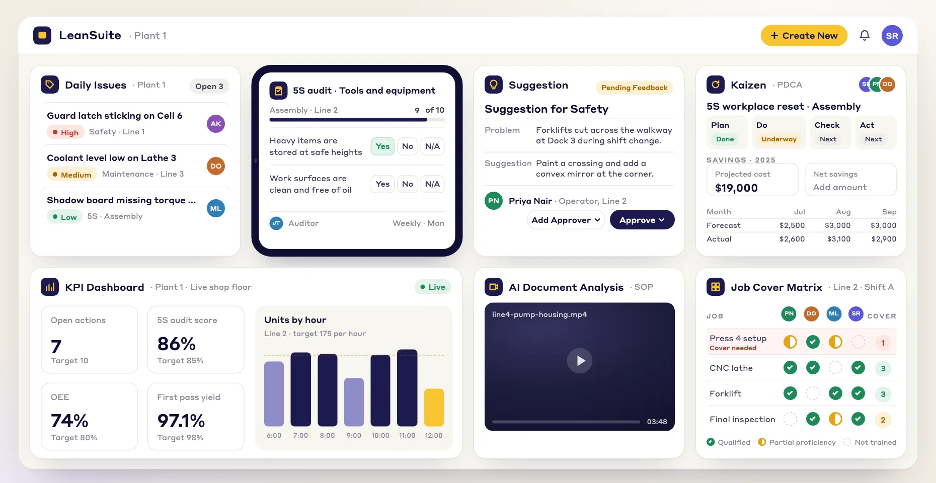
Lean Studio: A whiteboard for lean teams, with live data on it
Lean Studio is the whiteboard inside LeanSuite. Draw with stickies, shapes and arrows, start from 30 ready-made lean board templates, and put your live KPIs on the same board with 15 data widgets, so the huddle, the kaizen event and the strategy review all run from one screen.
What Lean Studio is
A whiteboard, 30 lean boards and live data in one place
Stickies, text, shapes and arrows
Draw with stickies and text, rectangles, rounded rectangles, ellipses and diamonds, arrows and charts, on a shared board the whole team can edit.
30 ready-made lean boards
Start from a fishbone, a value stream map, an SQCDP tier board, a suggestion board or an X-matrix instead of a blank canvas, then save your own version to My templates.
15 data widgets
Put live LeanSuite data on the board: a scorecard against targets, a day-by-day heatmap wheel per pillar, charts, a kanban, a table, or a Power BI or Looker report.
- Stickies
- Text
- Rectangle
- Rounded rectangle
- Ellipse
- Diamond
- Arrows
- Charts
On the board
What a board looks like with data on it
Four of the widgets and boards, drawn with sample data.
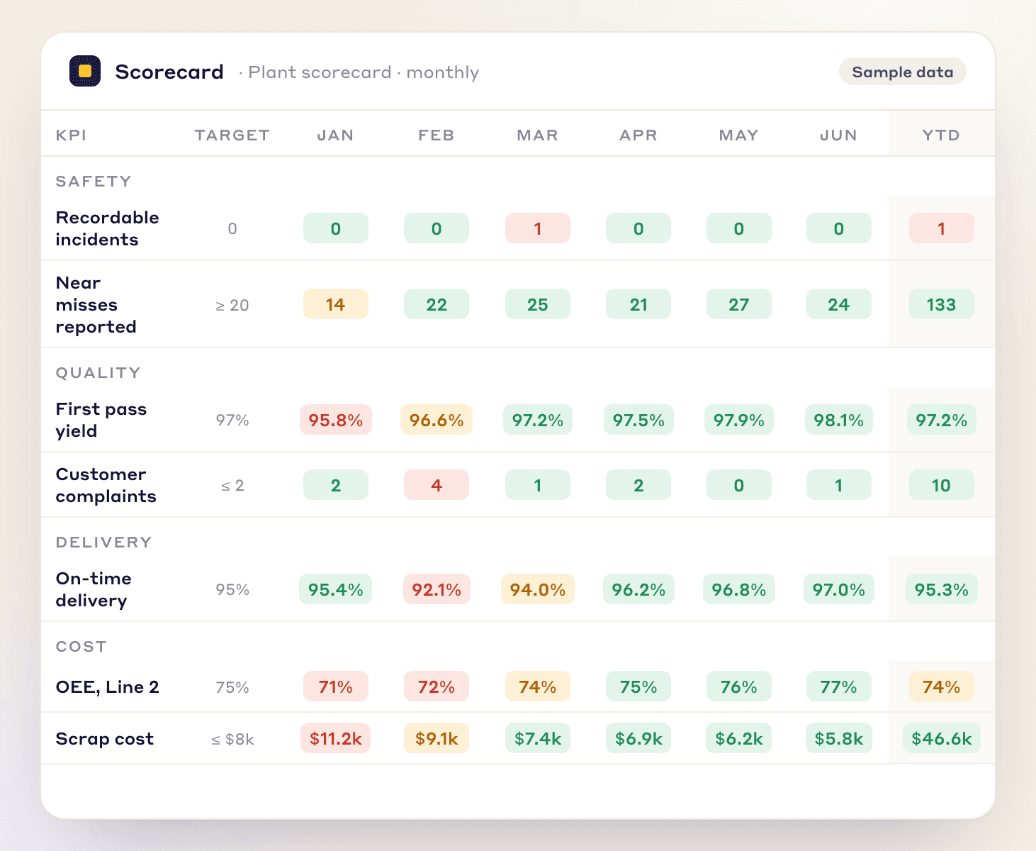
Scorecard
KPIs month by month against their targets, grouped by pillar, with a year-to-date column.
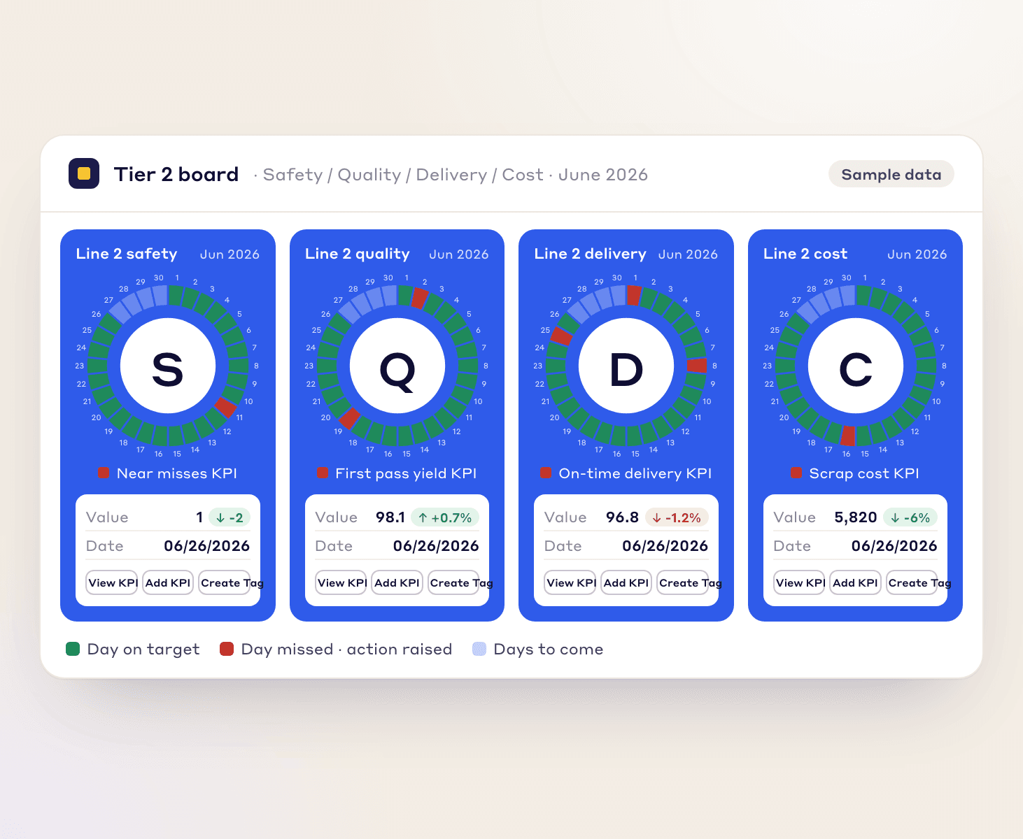
Safety, Quality, Delivery and Cost heatmaps
A circular calendar per pillar with the pillar letter in the centre: each day of the month is green when the linked KPI met its target and red when it missed, with the current value and its change below. A tag can be created straight from a red day.
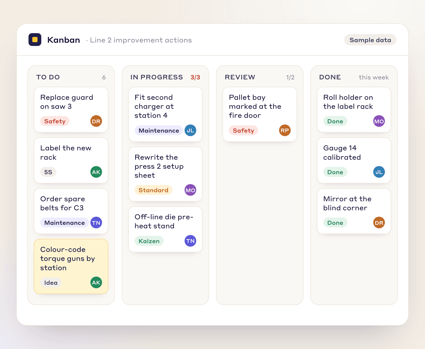
Kanban
Work items in the stages of a process, with a work-in-progress limit per column.
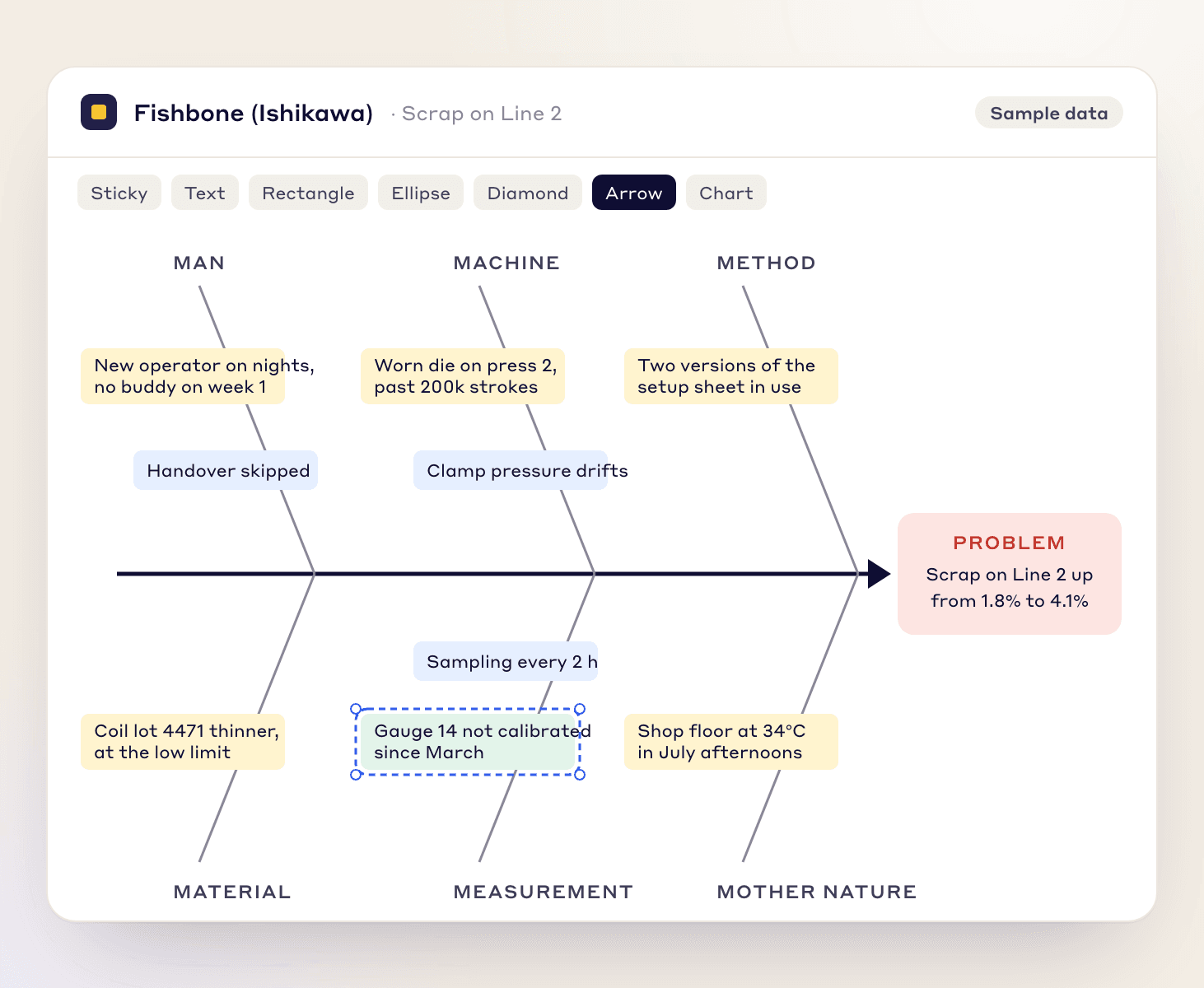
Fishbone (Ishikawa) board
One of the 30 board templates: the problem at the head, candidate causes on the six M bones.
15 widgets
The data widgets
Each widget as the product describes it.
Tier board
Widgets for a daily or weekly tier board
Scorecard
Review KPIs month by month or week by week against their targets, grouped by pillar, with a year-to-date column.
Safety Heatmap
Visualize events and activities over time using a calendar-style heatmap with character-based patterns.
Quality Heatmap
Visualize events and activities over time using a calendar-style heatmap with character-based patterns.
Delivery Heatmap
Visualize events and activities over time using a calendar-style heatmap with character-based patterns.
Cost Heatmap
Visualize events and activities over time using a calendar-style heatmap with character-based patterns.
Custom Heatmap
Visualize events and activities over time using a calendar-style heatmap with a custom character of your choice.
Charts
Charts drawn from your KPI data
Column Graph
Display your data using bars of different height, great for viewing actual data between date periods.
Line Graph
See your data plotted as points, a good way to visualise trend or compare date period.
Single Data
Emphasise the actual value of a single data over a date period.
Pie Chart (Single)
Represent a single data across multiple categories as a percentage.
Multiple Data Series
See how data affects one another by visualizing multiple data at the same time.
Stacked Data Graph
See how multiple data when stacked make up a total or percentage.
Work
Work items and plain data
Kanban
Visualise work items in various stages of a process.
Table
Display data in a tabular format.
Connect
Reports from other tools
External Report
Embed external reports from Looker, Power BI, or other sources.
30 board templates
The ready-made lean boards
Every board has a page: what it is for, what is on it, how to run a session with it, a worked example on sample data, the common mistakes, how it works in Lean Studio and where its output goes next in LeanSuite.
Problem solving
From a symptom to a root cause and a countermeasure
Process & flow
See a process end to end and where it waits
Daily management
Tier boards, huddles, audits and plan-vs-actual
Improvement & ideas
Collect, sort and prioritize improvement ideas
Team & strategy
Strategy deployment, retrospectives and skills
Use these boards in LeanSuite
The boards live inside LeanSuite. Try the interactive demo in your browser, or pilot LeanSuite on your own lines for 90 days.
Want a printable version instead? The free lean templates are PDF and Excel files for the same methods.
In practice
How teams use Lean Studio in a week
The same whiteboard runs three rhythms: the shift huddle, the improvement event and the monthly review. Each uses different boards and widgets.
- 1
Every shift
Tier 1 huddle, 10 to 15 minutes
The team stands at an SQCDP Tier Board or a Daily Huddle Board. The Safety, Quality, Delivery and Cost heatmap wheels show which days this month met target, the Scorecard shows this week's KPIs against target, and the team enters the day's values in the huddle. A red gets a sticky with an owner, a tag created from the widget, or an escalation to the tier 2 board. Concerns that need a cause go on the 3C Problem Board.
Widgets: Safety, Quality, Delivery and Cost heatmaps · Scorecard · Kanban
- 2
Midweek
Kaizen event, one to three days
The event team opens a Fishbone board to spread the causes, a 5 Whys board to drill one down, and a Yamazumi board or a Value Stream Map to see the work. Ideas are sorted on an Impact / Effort Matrix, and the Kaizen Event Report carries the before and after with a Column Graph widget for the numbers. Follow-ups land on the Kaizen Action Tracker with owners and dates.
Widgets: Column Graph · Line Graph · Table
- 3
Month end
Strategy review, 60 to 90 minutes
Plant leadership reads the Hoshin Bowling Chart, a Scorecard widget set month by month with a year-to-date column, against the Hoshin Kanri X-Matrix drawn at the start of the year. A KPI red two months running gets an A3. Reports that live in Power BI or Looker Studio sit on the same board through the External Report widget, and actions are assigned from the board.
Widgets: Scorecard · Multiple Data Series · External Report
Choosing
Whiteboard or data widgets: which to use when
Stickies and shapes are for thinking together; the widgets are for numbers that should not be copied by hand. Most boards use both.
| You want to | Use | Why |
|---|---|---|
| Spread out the causes of a problem | Stickies on a Fishbone or 5 Whys board | Thinking work: the team writes, moves and argues. No data feed needed. |
| See today's KPIs against target | Scorecard widget | The number comes from the KPI module with its target and RAG colour, so nobody copies it by hand. |
| See whether every day this month met target | Safety, Quality, Delivery or Cost heatmap widget | A day-by-day wheel per pillar, coloured from the linked KPI, with a tag one step away on a red day. |
| Show before and after a change | Column Graph or Line Graph widget | Both bars are drawn from the same data, so the comparison holds when the numbers update. |
| Move work through stages | Kanban widget, or the Kanban Board template | Cards and a work-in-progress limit per column; the widget sits on any board, the template is a whole board. |
| Draw a process | Shapes and arrows on a Swimlane or Value Stream Map board | Rounded rectangles, diamonds and ellipses are the map's vocabulary; the times go on stickies. |
| Bring in a report that already exists | External Report widget | Embeds Looker, Power BI or other sources next to LeanSuite KPIs instead of rebuilding the report. |
| List people against skills, or any plain data | Table widget | Rows and columns you type or colour, for a skills matrix or a bowling chart's plan row. |
FAQ
Lean Studio: common questions
Run your next huddle from a Lean Studio board
See the boards and widgets with sample data in the interactive demo, or pilot LeanSuite on your own lines for 90 days.