
Free template
Updated
X-bar and R control chart template
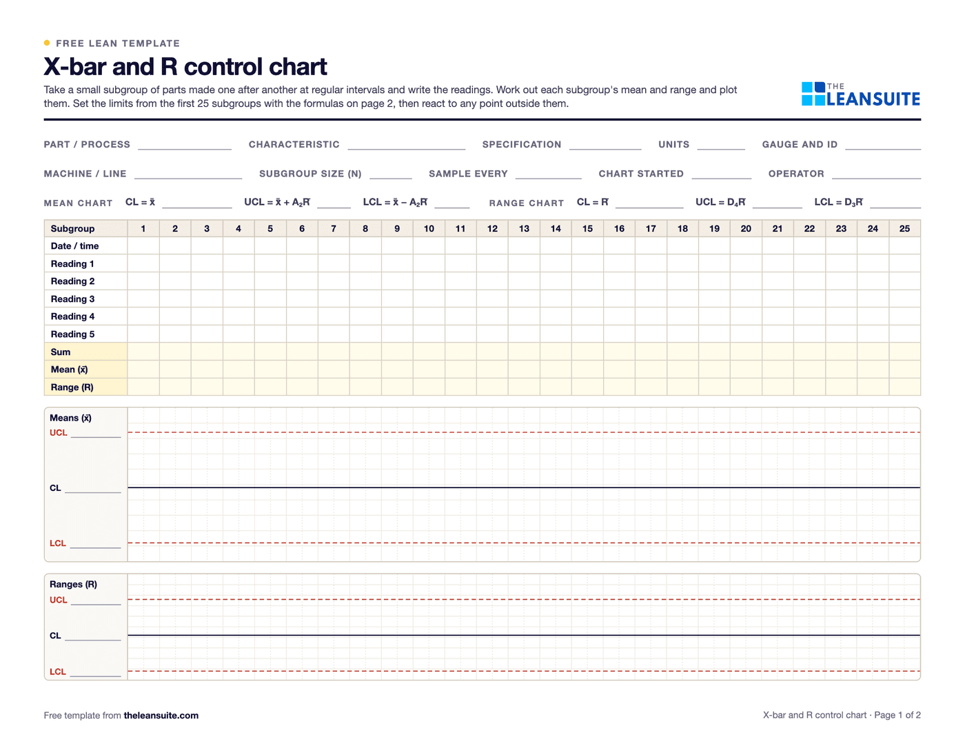
An X-bar and R control chart follows a process over time with two charts: the mean of each small subgroup of parts (x̄) and the range within it (R). Control limits worked out from the process's own data show how much it varies when nothing unusual is happening, so a point outside them, or a pattern such as a long run on one side of the center line, signals a special cause to find and fix. A control chart answers whether the process is stable; a capability study (Cpk) answers whether a stable process fits the specification. Page 1 of the PDF has the header fields, a data table for 25 subgroups of up to 5 readings with the sum, mean and range, and an x̄ chart and an R chart lined up under the subgroups, each with lines for the center line and the control limits. Page 2 has the limit formulas with the A2, D3, D4 and d2 constants for subgroups of 2 to 10, the common rules for spotting a special cause, a worked example and a reaction log. The Excel version takes subgroups of 2 to 10, works out x̄, R, the grand mean, the average range and both sets of limits, flags points outside the limits and 7 means in a row on one side of the center line, draws both charts with their limits, and has a worked example sheet and a reaction log.
Free to use: print it, copy it and edit it for your team. Enter your name and work email once to download.
When to use it
When to use an X-bar and R chart
- For a measured characteristic made in volume, where you can take small subgroups of parts made one after another (2 to 10, most often 4 or 5).
- On the key characteristics in a control plan, to watch the process while it runs instead of sorting parts afterwards.
- Before a capability study, to show the process is stable: a Cpk from an unstable process predicts nothing.
- After a change to a machine, tool, material or method, to see whether the process has shifted.
- Not for one reading at a time (an individuals chart fits better) or for counts of defects (use a p or c chart).
How to fill it in
- 1
Check the gauge first
Run a gauge R&R on the measurement system, so the chart shows the process and not the gauge.
- 2
Choose the subgroup
Parts made one after another, the same number each time, at a set interval: for example 5 parts every hour. Write the readings and the time.
- 3
Work out x̄ and R
For each subgroup, the mean (sum ÷ n) and the range (largest − smallest). Plot both.
- 4
Set the limits
After about 25 subgroups: x̿ ± A₂R̄ for the x̄ chart, D₄R̄ and D₃R̄ for the R chart, with the constants for your subgroup size.
- 5
React to signals
A point beyond a limit, a run of 7 on one side of the center line or a clear trend: find the cause, act on it and write both in the reaction log.
- 6
Keep the limits
Use the same limits on later sheets. Recalculate only after a deliberate process change, or after removing subgroups whose cause you found and fixed.
Constants
Control chart constants by subgroup size
A₂ sets the x̄ chart limits, D₃ and D₄ the R chart limits, and d₂ turns the average range into an estimate of the process standard deviation (R̄ ÷ d₂).
| Subgroup size n | A₂ | D₃ | D₄ | d₂ |
|---|---|---|---|---|
| 2 | 1.880 | 0 | 3.267 | 1.128 |
| 3 | 1.023 | 0 | 2.574 | 1.693 |
| 4 | 0.729 | 0 | 2.282 | 2.059 |
| 5 | 0.577 | 0 | 2.114 | 2.326 |
| 6 | 0.483 | 0 | 2.004 | 2.534 |
| 7 | 0.419 | 0.076 | 1.924 | 2.704 |
| 8 | 0.373 | 0.136 | 1.864 | 2.847 |
| 9 | 0.337 | 0.184 | 1.816 | 2.970 |
| 10 | 0.308 | 0.223 | 1.777 | 3.078 |
2
- A₂
- 1.880
- D₃
- 0
- D₄
- 3.267
- d₂
- 1.128
3
- A₂
- 1.023
- D₃
- 0
- D₄
- 2.574
- d₂
- 1.693
4
- A₂
- 0.729
- D₃
- 0
- D₄
- 2.282
- d₂
- 2.059
5
- A₂
- 0.577
- D₃
- 0
- D₄
- 2.114
- d₂
- 2.326
6
- A₂
- 0.483
- D₃
- 0
- D₄
- 2.004
- d₂
- 2.534
7
- A₂
- 0.419
- D₃
- 0.076
- D₄
- 1.924
- d₂
- 2.704
8
- A₂
- 0.373
- D₃
- 0.136
- D₄
- 1.864
- d₂
- 2.847
9
- A₂
- 0.337
- D₃
- 0.184
- D₄
- 1.816
- d₂
- 2.970
10
- A₂
- 0.308
- D₃
- 0.223
- D₄
- 1.777
- d₂
- 3.078
A filled-in example
Illustrative, not a benchmarkAn example: the bore of a machined housing, specification 24.980 to 25.040 mm, 25 subgroups of 5 (illustrative numbers). The Excel version's Example sheet has the same readings.
- Grand mean x̿ = 25.0104 mm, average range R̄ = 0.01356 mm.
- x̄ chart: A₂ × R̄ = 0.577 × 0.01356 = 0.00782, so UCL = 25.0182 mm and LCL = 25.0026 mm.
- R chart: UCL = 2.114 × 0.01356 = 0.0287 mm, LCL = 0.
- Subgroup 18 has a mean of 25.0254 mm, above the UCL, although every part in it was inside the specification. The tool offset had been entered wrong after an insert change.
The chart caught the shift before any part went out of specification. The offset was corrected and logged, and with subgroup 18 removed the limits became 25.0020 to 25.0176 mm around a grand mean of 25.0098 mm.
Common mistakes
Using the specification as control limits
Specification limits say what the customer allows for one part; control limits say what the process does. Drawing the tolerance on an x̄ chart hides real signals.
Recalculating the limits on every sheet
Limits that move with the data absorb every shift. Set them once from a stable period and keep them.
Charting without reacting
A chart nobody acts on is paperwork. Every signal needs a cause found and a line in the reaction log.
Mixing streams in one subgroup
Parts from two cavities, spindles or machines in one subgroup inflate the range and hide the difference between them. Chart each stream on its own.
Download the template
Free to use: print it, copy it and edit it for your team. Enter your name and work email once to download.
Run this template in LeanSuite
In LeanSuite quality checks run as digital checklists with number limits, an out-of-spec answer can raise a tag or start a CAPA automatically, and KPI Builder tracks quality KPIs against targets.
In the lean glossary
FAQ
X-bar and R control chart template: common questions
More free templates
All templates- 5S audit checklist template25 checks, five per S, scored 1 to 5, with a score summary and a chart of the five S's.
- Gemba walk checklistA walk plan and route, 30 prompts in six groups and a findings table with owners and due dates.
- Leader standard work templateA team leader's daily, weekly and monthly routine with a box per day, follow-ups and a weekly review.
- Autonomous maintenance (CILR) checklist20 clean, inspect, lubricate and retighten checks with a box per day, an abnormality log and sign-off.
- A3 problem solving templateThe standard seven-box A3 from background to follow-up, with a filled-in worked example. PDF and Excel.
- PDCA templateOne improvement cycle on one page: plan, do, check against the goal, then standardize or adjust. PDF and Excel.
- 5 Whys templateA problem statement, five why rows with evidence, the root cause and the countermeasure.
- 5W1H templateSix questions with prompts and evidence, turned into a problem statement before the root cause analysis.
- 8D report templateD0 to D8 on three pages: team, is/is not, containment, occurrence and escape causes, actions and closure.
- Poka-yoke worksheetEach step's possible errors, prevention or detection, the method, a device idea and a verified box.
- Skills matrix templatePeople by skills, a 0 to 4 scale, a training column and a coverage row that shows the gaps.
- Standard work sheet templateTakt time, each element's manual, machine and walk time on a time chart, key points and standard WIP.
- One point lesson (OPL) templateOne topic on one page: wrong way and right way pictures, key points, why it matters and a sign-off record.
- SMED changeover worksheetChangeover steps with times, internal or external, what can move, ideas and before/after totals.
- Kaizen event charter templateScope, team and roles, baseline and target metrics, a five-day schedule, risks and sign-off.
- RACI matrix template17 kaizen project tasks by 10 roles, with R, A, C, I drop-downs and a check for one accountable per task.
- Layered process audit (LPA) checklist20 yes, no or N/A checks at the station, a fixed-on-the-spot box, scores by group and a findings table.
- PFMEA template (process FMEA)Failure modes, effects and causes rated for severity, occurrence and detection, with RPN before and after action.
- 5S red tag log and red tagsA log of every red-tagged item with its decision, and six printable red tags to cut out.
- Shift handover templateProduction against plan, safety, quality, equipment, materials and people, and the open issues the next shift takes over.
- Kanban card templateSix production and six withdrawal kanban cards to print and cut out, with loop sizing and a card register.
- Pareto chart templateA tally sheet, the categories sorted largest first with cumulative %, and the chart. Excel does the sorting and drawing.
- Control plan templateWhat is checked at each step, against which limits, how, how often, and what to do when a result is out.
- Corrective action request (CAPA) formProblem, containment, root cause, corrective and preventive action, and proof the fix worked, on two pages.
- Idea suggestion formA one-page idea form with the supervisor's answer and points, and an idea log that tracks days to answer.
- Just Do It (JDI) card templateSix Just Do It cards per sheet for quick fixes, with the rules for what counts and a log of every card.
- Quick kaizen templateOne page for a small improvement: before and after, the cause, the countermeasure, the results and whether the standard changed.
- Time study sheetTime each element over 10 cycles and work out the average, lowest repeatable and standard time. Excel does the sums.
- Spaghetti diagram templateSquared paper to trace every trip, a tally of trips and distance, and a before and after comparison.
- OEE tracking sheetOne row per shift for a week. The Excel version works out availability, performance, quality and OEE and charts the week.
- Near miss report formA two-page near miss report from the first report to closure, and an Excel log with status and days open.
- Safety observation card templateFour behavior-based safety cards per sheet, with safe and at-risk checks, the conversation and a tally sheet.
- Job safety analysis (JSA) templateJob steps, hazards, risk scored before and after the controls, the hierarchy of controls, PPE and sign-off.
- Risk assessment matrix template (5×5)A color-coded 5 × 5 severity and likelihood matrix, a scoring guide and a risk register.
- Incident investigation report templateWhat happened, people, evidence and timeline, root cause with 5 Whys and contributing factors, actions and sign-off.
- Toolbox talk templateA record of a short safety talk: topic, key points, questions raised, actions and an attendee sign-in sheet.
- Lockout/tagout (LOTO) procedure templateA machine-specific LOTO procedure: energy sources and isolation points, the steps from shutdown to restart, and the annual review.
- Forklift inspection checklist23 pre-shift checks for a week on one page, a do-not-operate rule, and a defect and repair log.
- Non-conformance report (NCR) formA two-page NCR from the requirement against what was found to disposition and closure, and an Excel NCR log.
- CAPA log templateAn Excel CAPA tracker with status, days open, late flags and counts by source, plus a printable log and monthly review.
- Supplier corrective action request (SCAR) formA SCAR from the problem and containment asked for to the supplier's 8D-style response, verification and closure.
- First article inspection (FAI) report templatePart information, a ballooned characteristic table with tolerances and results, material and process certificates, and sign-off.
- Preventive maintenance checklist templateA PM checklist per machine with readings and sign-off, and a PM schedule that works out the next due date.
- Equipment downtime log (MTTR and MTBF)A breakdown and downtime log, with MTTR, MTBF and downtime by machine and cause worked out in Excel.
- Environmental aspects and impacts registerAn ISO 14001-style register of aspects and impacts, with significance scoring, legal requirements, controls and owners.
- Manufacturing process instruction (MPI) templateOperation steps with parameters, tools, quality checks, safety and a photo each, plus revision history and approval.
- Engineering process instruction (EPI) templateScope, parameters and limits, equipment and materials, validation steps, acceptance criteria, change history and approvals.
- Training sign-off sheetAn attendance and sign-off record where each person signs they understood, with a competence check and an Excel log.
- On-the-job training (OJT) checklistA job breakdown and the four TWI Job Instruction steps with sign-offs, the tries and the date the trainee qualified.
- New hire onboarding checklist (manufacturing)29 onboarding items from before day 1 to the 90-day review, with owners, dates and review notes.
- Competency assessment formEach task rated 0 to 4 on the skills matrix scale with the evidence seen, then the gaps and a training plan.
- Cross-training plan templateWho is learning which task, from and to which level, by when, and how many are qualified on each task.
- Absenteeism tracker templateA monthly attendance grid with codes, absence rate by person and team, and an optional Bradford factor.
- Engineering change request (ECR) formAn ECR form with the change, what it touches, risk and approvals, and an Excel log that tracks each change to done.
- Design FMEA (DFMEA) templateA design FMEA worksheet with S, O, D and RPN before and after action, a class column and a design rating guide.
- Process flow diagram templateA squared sheet to draw the flow with a symbol key, and a step table that counts operations, moves, checks, waits and storage.
- PPAP checklistThe 18 PPAP elements with owner, due date and status, the five submission levels and a readiness count.
- Process capability (Cpk) study sheet25 subgroups of readings with Cp, Cpk, Pp and Ppk worked out, control limits to check stability, and a histogram.
- Office 5S audit checklist25 checks written for offices and shared areas, five per S, scored 1 to 5, with a score summary and actions.
- Floor marking color guideA floor marking color standard with swatches, marks and line widths to fill in, and a floor marking check with a layout sketch.
- Shadow board plannerPlan a shadow board: the tool list with how often each is used, a squared layout, labels, and a month of daily checks.
- Lubrication schedule templateEvery lube point with lubricant, method, amount, frequency and who, with next due dates and a monthly sign-off record.
- TPM tag logEvery abnormality tag with type, who fixes it, priority and dates, with days open and counts by type and week.
- Autonomous maintenance step auditCriteria for each of the seven autonomous maintenance steps, scored 0 to 2, with the step result and the decision to move on.
- Inventory cycle count sheetA blind count sheet with variance and tolerance, an ABC count schedule and record accuracy, worked out in Excel.
- Hour-by-hour production boardHourly plan against actual with running totals and the reason for each miss, plus a shift summary by reason.
- Cost savings trackerA savings log with hard and soft savings, payback and Finance's sign-off, plus a glide path against the year's target.
- CapEx request formA capital request with options, costs, benefits, payback and NPV, and the approval levels the amount needs.
- Cost-benefit analysis templateUp to three options side by side with costs, hard and soft benefits, payback, NPV and the benefit-cost ratio.
- Cost of poor quality (COPQ) worksheetCost of quality by prevention, appraisal, internal and external failure, with COPQ as a share of sales.
- Incoming inspection checklistReceiving inspection checks from paperwork to sample, the sampling plan, the decision, and an Excel log by supplier.
- Supplier audit checklistA supplier process audit of 32 questions scored 0 to 3, with section scores, a rating and the findings.
- Supplier scorecardMonthly PPM, on-time delivery and SCAR measures turned into points, a weighted score and a rating per supplier.
- Receiving logA dock receiving log with quantities, damage, QC holds and putaway, plus a discrepancy report and dock-to-stock time.
- Warehouse safety inspection checklistThirty warehouse safety checks from aisles to fire exits, marked OK or Not OK, with an action for every finding.
- Pallet racking inspection checklistRack checks per aisle with a green, amber and red damage rating, and a damage log with repair dates.
- Pre-shipment inspection checklistThe last check before shipping: part, quantity, labels, packaging, paperwork and photos, then release.
- Material shortage logEvery part short with its need date, line impact, ETA and escalation, and counts by reason and supplier.
- Safety audit checklistThirty-four plant-wide safety checks answered Yes, No or N/A, scored by area, with a risk rating and an action for every No.
- Ergonomic risk assessment checklistScreen a task for 21 ergonomic risk factors, score how long each lasts, and rank tasks so the worst get controls first.
- Maintenance work order formOne form per maintenance job from request to handback, and a log that tracks response, completion and backlog by priority.
- Six big losses worksheetWhere a machine's planned time goes: the six big losses in minutes, ranked, with A, P, Q and OEE worked out.
- Andon response logEvery andon call with response and fix times, flags against your targets, and counts by type and station.
- Changeover checklist25 checks for every changeover, a record of planned and actual times, and a log of changeover time against target.
- Kanban sizing calculatorHow many kanban cards each loop needs, per part, with the change from today's cards and what the loop holds in days.
- Gage R&R study sheet10 parts, 2 or 3 appraisers, 2 or 3 trials: EV, AV, GRR, PV, %GRR and ndc by the average and range method.
- Root cause analysis templateOne report from problem statement to proof: containment, evidence, analysis, verified causes, actions and the effectiveness check.
Can't find the template you need?
Tell us what you're looking for. We'll make it and send it to your inbox, free.
A shift handover sheet, a red tag log, a changeover checklist for one machine: if your team uses it on the floor, ask.