

Free template
Pareto chart template
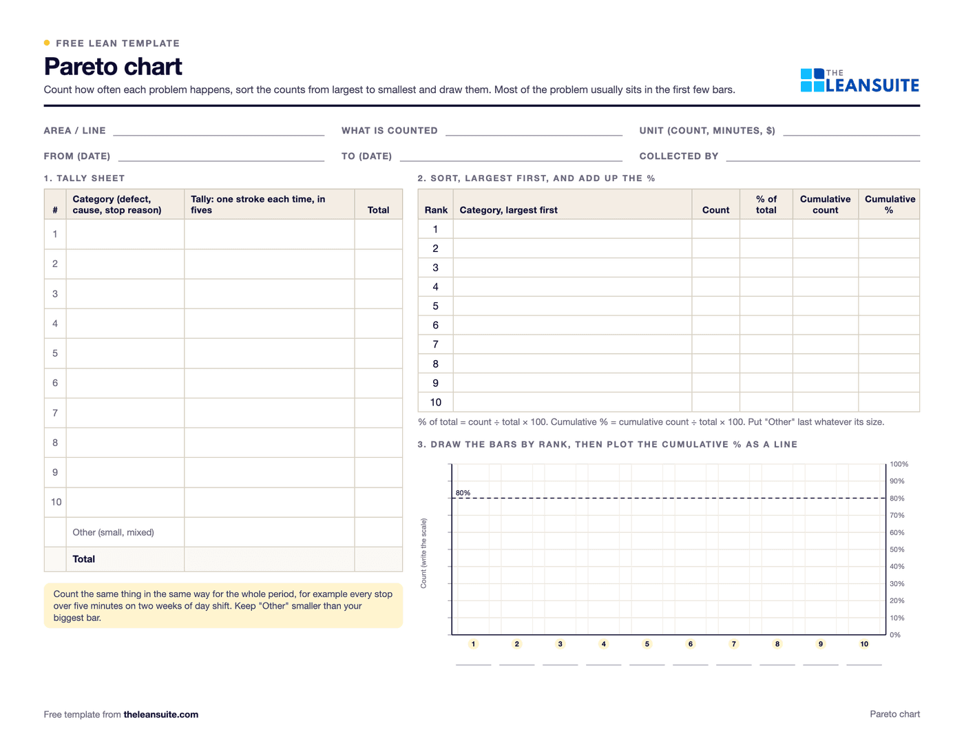
A Pareto chart is a bar chart of problem categories sorted from the largest to the smallest, with a line for the cumulative percentage, so you can see which few categories make up most of the total. It is one of the seven basic quality tools and usually the first step in deciding which problem to work on. The printable version has a tally sheet for counting ten categories plus other, a table to sort them and work out each one's percentage and the running total, and a blank chart with a cumulative % scale to draw on. In the Excel version you enter the counts by day or shift, and it sorts the categories, works out the percentages and draws the chart.
Free to use: print it, copy it and edit it for your team. Enter your name and work email once to download.
When to use it
When to use a Pareto chart
- To choose which defect, downtime reason or complaint to work on first.
- At the start of a root cause analysis or an A3, to show with data why this problem was picked.
- After a fix, to compare the chart before and after and see whether the top bar came down.
- To break a big bar down further, for example short shots by machine or by shift.
- Not with only a handful of events: count long enough that the order of the bars is stable.
How to fill it in
- 1
Decide what to count
Pick one thing, such as defects, stops over five minutes or complaints, and the unit: occurrences, minutes or cost. Write it and the period on the sheet.
- 2
Set the categories
Agree the categories before you start and write clear names. Keep an other row for the rare ones.
- 3
Tally for a fixed period
Make a stroke on the tally sheet each time it happens, in groups of five, or enter the counts per day or shift in the Excel version.
- 4
Sort and add up
List the categories from the largest total to the smallest, with other last. Work out each one's percentage of the total and the cumulative percentage.
- 5
Draw the chart
Draw a bar for each category in rank order against the left axis, then plot the cumulative % against the right axis and join the points. The Excel version draws it for you.
- 6
Pick where to start
Look at the first few bars, usually where the cumulative line is steepest. Start a root cause analysis on the top one.
A filled-in example
Illustrative, not a benchmarkAn example: two weeks of defect counts from an injection molding cell, recorded on the tally sheet at the end of each shift.
- 110 defects in six categories: short shots 46, flash 31, sink marks 14, scratches 9, wrong color 6 and other 4.
- Sorted, short shots are 42% of the total, and short shots and flash together are 70%.
- The first three categories reach 83% on the cumulative line.
The team starts a root cause analysis on short shots, then flash. Scratches and wrong color can wait: together they are 14% of the count.
Common mistakes
Changing the categories halfway
Renaming or splitting categories during the count makes the totals meaningless. Fix them first.
Too short a period
A few days of data can put a one-off at the top. Count long enough that the order settles.
A big other bar
If other is bigger than your largest category, it is hiding something. Split it up.
Counting when cost matters more
The most frequent defect is not always the most expensive. Draw a second chart by cost or minutes when the difference matters.
Stopping at the chart
A Pareto chart shows where to look, not why it happens. Follow the top bar with a 5 Whys or a fishbone diagram.
Download the template
Free to use: print it, copy it and edit it for your team. Enter your name and work email once to download.
Run this template in LeanSuite
LeanSuite's QA Matrix puts a dollar cost and a priority on each defect, and a live Pareto chart shows which defects cost the most, so engineering knows what to fix first.
In the lean glossary
FAQ
Pareto chart template: common questions
More free templates
All templates- 5S audit checklist template25 checks, five per S, scored 1 to 5, with a score summary and a chart of the five S's.
- Gemba walk checklistA walk plan and route, 30 prompts in six groups and a findings table with owners and due dates.
- Leader standard work templateA team leader's daily, weekly and monthly routine with a box per day, follow-ups and a weekly review.
- Autonomous maintenance (CILR) checklist20 clean, inspect, lubricate and retighten checks with a box per day, an abnormality log and sign-off.
- A3 problem solving templateThe standard seven-box A3 on one landscape sheet, from background to follow-up.
- PDCA templateOne improvement cycle on one landscape page: plan, do, check against the goal, then standardize or adjust.
- 5 Whys templateA problem statement, five why rows with evidence, the root cause and the countermeasure.
- 5W1H templateSix questions with prompts and evidence, turned into a problem statement before the root cause analysis.
- 8D report templateD0 to D8 on three pages: team, is/is not, containment, occurrence and escape causes, actions and closure.
- Poka-yoke worksheetEach step's possible errors, prevention or detection, the method, a device idea and a verified box.
- Skills matrix templatePeople by skills, a 0 to 4 scale, a training column and a coverage row that shows the gaps.
- Standard work sheet templateTakt time, each element's manual, machine and walk time on a time chart, key points and standard WIP.
- One point lesson (OPL) templateOne topic on one page: wrong way and right way pictures, key points, why it matters and a sign-off record.
- SMED changeover worksheetChangeover steps with times, internal or external, what can move, ideas and before/after totals.
- Kaizen event charter templateScope, team and roles, baseline and target metrics, a five-day schedule, risks and sign-off.
- RACI matrix template17 kaizen project tasks by 10 roles, with R, A, C, I drop-downs and a check for one accountable per task.
- Layered process audit (LPA) checklist20 yes, no or N/A checks at the station, a fixed-on-the-spot box, scores by group and a findings table.
- PFMEA template (process FMEA)Failure modes, effects and causes rated for severity, occurrence and detection, with RPN before and after action.
- 5S red tag log and red tagsA log of every red-tagged item with its decision, and six printable red tags to cut out.
- Shift handover templateProduction against plan, safety, quality, equipment, materials and people, and the open issues the next shift takes over.
- Kanban card templateSix production and six withdrawal kanban cards to print and cut out, with loop sizing and a card register.
- Control plan templateWhat is checked at each step, against which limits, how, how often, and what to do when a result is out.
- Corrective action request (CAPA) formProblem, containment, root cause, corrective and preventive action, and proof the fix worked, on two pages.
Can't find the template you need?
Tell us what you're looking for. We'll make it and send it to your inbox, free.
A shift handover sheet, a red tag log, a changeover checklist for one machine: if your team uses it on the floor, ask.