
Free template
Updated
Scatter diagram template
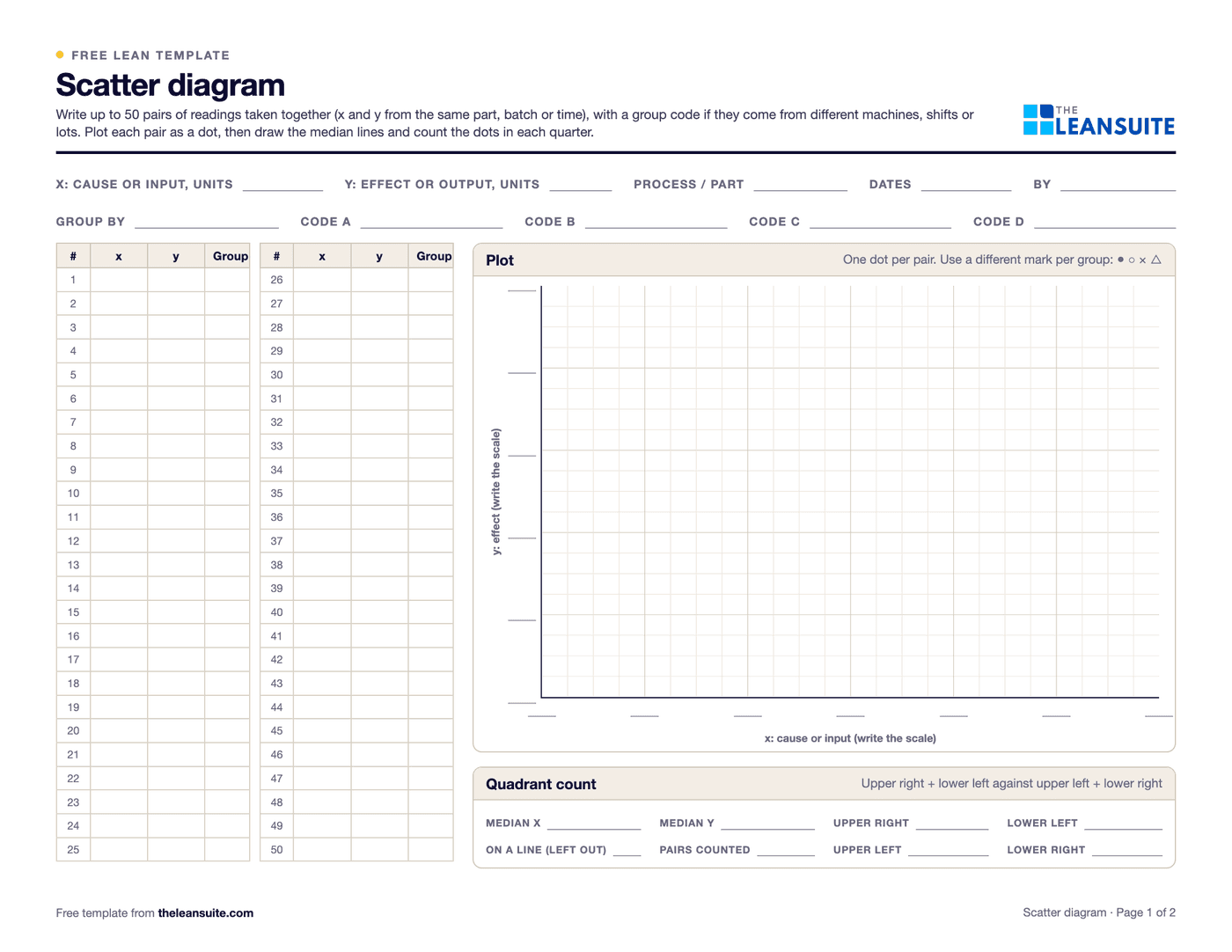
A scatter diagram plots pairs of measurements, one on each axis, to show whether one changes with the other: for example feed rate against surface roughness. The correlation coefficient r, from −1 to +1, puts a number on how closely the dots follow a straight line, and the least squares line helps read the trend. A pattern shows that two things move together, not that one causes the other. It is one of the seven basic quality tools. Page 1 of the PDF has the header fields, a table for 50 pairs with a group code, a plot grid and a box for the quadrant (median) count. Page 2 shows five typical patterns, a rough guide to reading r, the formulas for r, the slope and the intercept, the quadrant method, the warnings about cause and stratification, and a worked example plotted to scale. The Excel version takes up to 50 pairs, flags and leaves out rows without both values, and works out n, the sums, r, R², the slope and intercept of the least squares line, a rough strength label, the medians and the quadrant count, and r, slope and intercept for up to 4 groups. It plots each group with its own marker, draws the line and has a worked example sheet.
Free to use: print it, copy it and edit it for your team. Enter your name and work email once to download.
When to use it
When to use a scatter diagram
- To test a suspected cause from a fishbone or a 5 Whys: whether the defect or the measurement changes when the input changes.
- To find the setting range that keeps an output in specification, such as a temperature, pressure, speed or feed.
- To check whether a quick test can stand in for a slow one: a hardness reading against a tensile test, an in-process gauge against the lab.
- When data from several machines, shifts or lots is mixed, to see whether splitting it by group changes the picture.
How to fill it in
- 1
Choose the pair
x is the suspected cause or input, y the effect or output. Each pair comes from the same part, batch or moment.
- 2
Collect the pairs
Aim for 30 or more, over the widest range of x you can safely run, with a group code for the machine, shift or lot.
- 3
Plot
x across, y up, with scales that fill the grid. One dot per pair, and a different mark for each group.
- 4
Count the quarters
Draw lines at the median x and the median y. Count the dots upper right plus lower left against upper left plus lower right, leaving out dots on a line.
- 5
Work out r and the line
From the sums on page 2, or let the Excel version do it. Read the line only inside the range of x you tested.
- 6
Split by group, then confirm
Work out r for each group. Confirm a suspected cause with a trial that changes only x before you change the process.
Reading r
What the correlation coefficient r says
A rough guide only: cut-offs vary by field, a curved pattern can give r near 0, and a few pairs can give a high r by chance. Always look at the plot.
| r | Reads as | What to do |
|---|---|---|
| 0.7 to 1 | Strong positive: y rises as x rises | Likely related: confirm the cause with a trial |
| 0.3 to 0.7 | Moderate positive | Related, with other factors at work: stratify and look for them |
| −0.3 to 0.3 | Little or no straight-line relationship | Check the plot for a curve or for groups pulling apart |
| −0.7 to −0.3 | Moderate negative | Related, with other factors at work: stratify and look for them |
| −1 to −0.7 | Strong negative: y falls as x rises | Likely related: confirm the cause with a trial |
0.7 to 1
- Reads as
- Strong positive: y rises as x rises
- What to do
- Likely related: confirm the cause with a trial
0.3 to 0.7
- Reads as
- Moderate positive
- What to do
- Related, with other factors at work: stratify and look for them
−0.3 to 0.3
- Reads as
- Little or no straight-line relationship
- What to do
- Check the plot for a curve or for groups pulling apart
−0.7 to −0.3
- Reads as
- Moderate negative
- What to do
- Related, with other factors at work: stratify and look for them
−1 to −0.7
- Reads as
- Strong negative: y falls as x rises
- What to do
- Likely related: confirm the cause with a trial
A filled-in example
Illustrative, not a benchmarkAn example: feed rate against surface roughness Ra on two lathes, 24 pairs, 12 from each (illustrative numbers). The Excel version's Worked example sheet has all 24 pairs.
- All 24 pairs: r = 0.80, R² = 0.64, least squares line Ra = 1.072 + 6.00 × feed.
- Quadrant count: medians 0.22 mm/rev and 2.455 µm. Upper right 9, lower left 9, upper left 2, lower right 2, and 2 dots on the median line left out: 18 against 4, a positive relationship.
- Split by lathe: r = 0.96 for lathe A (Ra = 0.373 + 7.66 × feed) and 0.97 for lathe B (Ra = 0.993 + 7.91 × feed).
- Over the feeds both lathes ran, 0.14 to 0.30 mm/rev, lathe B leaves a surface 0.65 to 0.69 µm rougher at the same feed.
Mixing the lathes made the relationship look weaker than it is and hid a second cause: the machine. Within each lathe, roughness follows feed closely, and lathe B went on the list for a check at the machine before anyone changed the feed.
Common mistakes
Reading correlation as cause
Two things can move together because both follow a third, such as temperature or time of day. Confirm with a trial that changes only x.
Mixing groups
Data from different machines, shifts or lots can hide a strong pattern or create a false one. Give each pair a group code and work out r per group.
Too narrow a range of x
If x hardly varies, no relationship can show, however strong it is. Run x over the widest range you can safely test.
Stretching the line
The least squares line describes the range you tested. Outside it the relationship may bend or break.
Download the template
Free to use: print it, copy it and edit it for your team. Enter your name and work email once to download.
Run this template in LeanSuite
In LeanSuite defects are captured as they happen and traced to their root causes with 5 Whys, 4M1D and fishbone, and KPI Builder tracks quality KPIs against targets and shows where defects happen.
In the lean glossary
Free tools
FAQ
Scatter diagram template: common questions
More free templates
All templates- 5S audit checklist template25 checks, five per S, scored 1 to 5, with a score summary and a chart of the five S's.
- Gemba walk checklistA walk plan and route, 30 prompts in six groups and a findings table with owners and due dates.
- Leader standard work templateA team leader's daily, weekly and monthly routine with a box per day, follow-ups and a weekly review.
- Autonomous maintenance (CILR) checklist20 clean, inspect, lubricate and retighten checks with a box per day, an abnormality log and sign-off.
- A3 problem solving templateThe standard seven-box A3 from background to follow-up, with a filled-in worked example. PDF and Excel.
- PDCA templateOne improvement cycle on one page: plan, do, check against the goal, then standardize or adjust. PDF and Excel.
- 5 Whys templateA problem statement, five why rows with evidence, the root cause and the countermeasure.
- 5W1H templateSix questions with prompts and evidence, turned into a problem statement before the root cause analysis.
- 8D report templateD0 to D8 on three pages: team, is/is not, containment, occurrence and escape causes, actions and closure.
- Poka-yoke worksheetEach step's possible errors, prevention or detection, the method, a device idea and a verified box.
- Skills matrix templatePeople by skills, a 0 to 4 scale, a training column and a coverage row that shows the gaps.
- Standard work sheet templateTakt time, each element's manual, machine and walk time on a time chart, key points and standard WIP.
- One point lesson (OPL) templateOne topic on one page: wrong way and right way pictures, key points, why it matters and a sign-off record.
- SMED changeover worksheetChangeover steps with times, internal or external, what can move, ideas and before/after totals.
- Kaizen event charter templateScope, team and roles, baseline and target metrics, a five-day schedule, risks and sign-off.
- RACI matrix template17 kaizen project tasks by 10 roles, with R, A, C, I drop-downs and a check for one accountable per task.
- Layered process audit (LPA) checklist20 yes, no or N/A checks at the station, a fixed-on-the-spot box, scores by group and a findings table.
- PFMEA template (process FMEA)Failure modes, effects and causes rated for severity, occurrence and detection, with RPN before and after action.
- 5S red tag log and red tagsA log of every red-tagged item with its decision, and six printable red tags to cut out.
- Shift handover templateProduction against plan, safety, quality, equipment, materials and people, and the open issues the next shift takes over.
- Kanban card templateSix production and six withdrawal kanban cards to print and cut out, with loop sizing and a card register.
- Pareto chart templateA tally sheet, the categories sorted largest first with cumulative %, and the chart. Excel does the sorting and drawing.
- Control plan templateWhat is checked at each step, against which limits, how, how often, and what to do when a result is out.
- Corrective action request (CAPA) formProblem, containment, root cause, corrective and preventive action, and proof the fix worked, on two pages.
- Idea suggestion formA one-page idea form with the supervisor's answer and points, and an idea log that tracks days to answer.
- Just Do It (JDI) card templateSix Just Do It cards per sheet for quick fixes, with the rules for what counts and a log of every card.
- Quick kaizen templateOne page for a small improvement: before and after, the cause, the countermeasure, the results and whether the standard changed.
- Time study sheetTime each element over 10 cycles and work out the average, lowest repeatable and standard time. Excel does the sums.
- Spaghetti diagram templateSquared paper to trace every trip, a tally of trips and distance, and a before and after comparison.
- OEE tracking sheetOne row per shift for a week. The Excel version works out availability, performance, quality and OEE and charts the week.
- Near miss report formA two-page near miss report from the first report to closure, and an Excel log with status and days open.
- Safety observation card templateFour behavior-based safety cards per sheet, with safe and at-risk checks, the conversation and a tally sheet.
- Job safety analysis (JSA) templateJob steps, hazards, risk scored before and after the controls, the hierarchy of controls, PPE and sign-off.
- Risk assessment matrix template (5×5)A color-coded 5 × 5 severity and likelihood matrix, a scoring guide and a risk register.
- Incident investigation report templateWhat happened, people, evidence and timeline, root cause with 5 Whys and contributing factors, actions and sign-off.
- Toolbox talk templateA record of a short safety talk: topic, key points, questions raised, actions and an attendee sign-in sheet.
- Lockout/tagout (LOTO) procedure templateA machine-specific LOTO procedure: energy sources and isolation points, the steps from shutdown to restart, and the annual review.
- Forklift inspection checklist23 pre-shift checks for a week on one page, a do-not-operate rule, and a defect and repair log.
- Non-conformance report (NCR) formA two-page NCR from the requirement against what was found to disposition and closure, and an Excel NCR log.
- CAPA log templateAn Excel CAPA tracker with status, days open, late flags and counts by source, plus a printable log and monthly review.
- Supplier corrective action request (SCAR) formA SCAR from the problem and containment asked for to the supplier's 8D-style response, verification and closure.
- First article inspection (FAI) report templatePart information, a ballooned characteristic table with tolerances and results, material and process certificates, and sign-off.
- Preventive maintenance checklist templateA PM checklist per machine with readings and sign-off, and a PM schedule that works out the next due date.
- Equipment downtime log (MTTR and MTBF)A breakdown and downtime log, with MTTR, MTBF and downtime by machine and cause worked out in Excel.
- Environmental aspects and impacts registerAn ISO 14001-style register of aspects and impacts, with significance scoring, legal requirements, controls and owners.
- Manufacturing process instruction (MPI) templateOperation steps with parameters, tools, quality checks, safety and a photo each, plus revision history and approval.
- Engineering process instruction (EPI) templateScope, parameters and limits, equipment and materials, validation steps, acceptance criteria, change history and approvals.
- Training sign-off sheetAn attendance and sign-off record where each person signs they understood, with a competence check and an Excel log.
- On-the-job training (OJT) checklistA job breakdown and the four TWI Job Instruction steps with sign-offs, the tries and the date the trainee qualified.
- New hire onboarding checklist (manufacturing)29 onboarding items from before day 1 to the 90-day review, with owners, dates and review notes.
- Competency assessment formEach task rated 0 to 4 on the skills matrix scale with the evidence seen, then the gaps and a training plan.
- Cross-training plan templateWho is learning which task, from and to which level, by when, and how many are qualified on each task.
- Absenteeism tracker templateA monthly attendance grid with codes, absence rate by person and team, and an optional Bradford factor.
- Engineering change request (ECR) formAn ECR form with the change, what it touches, risk and approvals, and an Excel log that tracks each change to done.
- Design FMEA (DFMEA) templateA design FMEA worksheet with S, O, D and RPN before and after action, a class column and a design rating guide.
- Process flow diagram templateA squared sheet to draw the flow with a symbol key, and a step table that counts operations, moves, checks, waits and storage.
- PPAP checklistThe 18 PPAP elements with owner, due date and status, the five submission levels and a readiness count.
- Process capability (Cpk) study sheet25 subgroups of readings with Cp, Cpk, Pp and Ppk worked out, control limits to check stability, and a histogram.
- Office 5S audit checklist25 checks written for offices and shared areas, five per S, scored 1 to 5, with a score summary and actions.
- Floor marking color guideA floor marking color standard with swatches, marks and line widths to fill in, and a floor marking check with a layout sketch.
- Shadow board plannerPlan a shadow board: the tool list with how often each is used, a squared layout, labels, and a month of daily checks.
- Lubrication schedule templateEvery lube point with lubricant, method, amount, frequency and who, with next due dates and a monthly sign-off record.
- TPM tag logEvery abnormality tag with type, who fixes it, priority and dates, with days open and counts by type and week.
- Autonomous maintenance step auditCriteria for each of the seven autonomous maintenance steps, scored 0 to 2, with the step result and the decision to move on.
- Inventory cycle count sheetA blind count sheet with variance and tolerance, an ABC count schedule and record accuracy, worked out in Excel.
- Hour-by-hour production boardHourly plan against actual with running totals and the reason for each miss, plus a shift summary by reason.
- Cost savings trackerA savings log with hard and soft savings, payback and Finance's sign-off, plus a glide path against the year's target.
- CapEx request formA capital request with options, costs, benefits, payback and NPV, and the approval levels the amount needs.
- Cost-benefit analysis templateUp to three options side by side with costs, hard and soft benefits, payback, NPV and the benefit-cost ratio.
- Cost of poor quality (COPQ) worksheetCost of quality by prevention, appraisal, internal and external failure, with COPQ as a share of sales.
- Incoming inspection checklistReceiving inspection checks from paperwork to sample, the sampling plan, the decision, and an Excel log by supplier.
- Supplier audit checklistA supplier process audit of 32 questions scored 0 to 3, with section scores, a rating and the findings.
- Supplier scorecardMonthly PPM, on-time delivery and SCAR measures turned into points, a weighted score and a rating per supplier.
- Receiving logA dock receiving log with quantities, damage, QC holds and putaway, plus a discrepancy report and dock-to-stock time.
- Warehouse safety inspection checklistThirty warehouse safety checks from aisles to fire exits, marked OK or Not OK, with an action for every finding.
- Pallet racking inspection checklistRack checks per aisle with a green, amber and red damage rating, and a damage log with repair dates.
- Pre-shipment inspection checklistThe last check before shipping: part, quantity, labels, packaging, paperwork and photos, then release.
- Material shortage logEvery part short with its need date, line impact, ETA and escalation, and counts by reason and supplier.
- Safety audit checklistThirty-four plant-wide safety checks answered Yes, No or N/A, scored by area, with a risk rating and an action for every No.
- Ergonomic risk assessment checklistScreen a task for 21 ergonomic risk factors, score how long each lasts, and rank tasks so the worst get controls first.
- Maintenance work order formOne form per maintenance job from request to handback, and a log that tracks response, completion and backlog by priority.
- Six big losses worksheetWhere a machine's planned time goes: the six big losses in minutes, ranked, with A, P, Q and OEE worked out.
- Andon response logEvery andon call with response and fix times, flags against your targets, and counts by type and station.
- Changeover checklist25 checks for every changeover, a record of planned and actual times, and a log of changeover time against target.
- Kanban sizing calculatorHow many kanban cards each loop needs, per part, with the change from today's cards and what the loop holds in days.
- Kaizen event trackerEvery kaizen event on one sheet: status, roles, the metric against target, open actions and the 30, 60 and 90 day checks.
- Standard work audit checklist24 checks of a job against its written standard, ten timed cycles, and each gap sorted by cause before anyone acts.
- Defect check sheetTally defects by type and day, with units inspected, defect rates, a location sheet and the week's Pareto.
- TWI job breakdown sheetThe TWI Job Instruction breakdown of a job into important steps, key points and reasons, with a worked example and the four steps.
- Standard work combination tableOne operator's manual, machine, walk and wait time on a time chart against takt, with machine cycles and a process capacity sheet.
- Lead time worksheetProduction lead time from the inventory waiting at each step, value-added time and process cycle efficiency, plus an order traced from order to delivery.
- Waste walk checklist (TIMWOODS)32 things to look for across the eight wastes, with where and how much, and a findings log with dot votes, owners and dates.
- Maintenance KPI trackerMTBF, MTTR, availability and PM compliance per asset and month, plant figures from the totals, planned maintenance % and backlog in weeks.
- Daily huddle agendaA 15-minute start-of-shift stand-up in six timed blocks, with yesterday's SQCDP results, today's plan, actions and escalations.
- DMAIC project charter templateThe Define-phase charter on one page: problem and goal, metrics, scope, team and phase dates, with savings and a tollgate checklist.
- Water spider route plan (mizusumashi)A water spider's fixed route: stops with arrival times, what is delivered and collected, route time against the cycle, cart load and a trip log.
- Cost deployment matrixWCM cost deployment on paper and in Excel: loss quantities by process, causal and resultant losses, the cost of each loss, a Pareto and the projects that recover them.
- Equipment criticality analysisAssets scored 1 to 5 on six criteria with your own weights, ranked and sorted into classes A, B and C with a safety override and a suggested maintenance strategy.
- Bottleneck analysis worksheetEffective capacity per station from cycle time, parallel units, availability and yield, the bottleneck, takt and utilization, a queue cross-check and the five focusing steps.
- QA matrix templateDefect modes against stations in flow order: where each is made and first caught, a weight × occurrence × detection score, an AA to C class and the escapes flagged.
- Fault tree analysis templateA drawing area with the FTA symbols, an event table with probabilities and minimal cut sets, and the gates worked out bottom-up in Excel.
- Is / is not analysis templateWhat, where, when and extent with is, is not, distinctions and changes, then each possible cause tested against every pair and ranked.
- 5G investigation sheetConfirm the facts before naming a cause: 5W1H, the five G's with 20 prompts, the gap against the principle and the standard, and the countermeasures.
- Yokoten tracker (horizontal deployment)Copy a proven improvement line by line: the source result, each candidate's own before and after, its share of the source's improvement and the standard updated.
- Coaching kata template (improvement kata storyboard)The learner's storyboard (target condition, current condition, obstacles, PDCA cycles) and a fold-over card with the coach's five questions.
- SMART goals templateWrite a goal, test it against the five SMART letters, then track progress toward the target against the time used.
- Lean readiness assessment templateTwenty statements in four factors, scored 1 to 5 by several people on their own, with averages, the spread between them and the actions.
- Nemawashi template (stakeholder plan)Plan the one-to-one conversations before a decision: who to talk to in what order, their concerns, what changed and where they stand.
- Breakdown analysis reportOne equipment breakdown from the stop to the 90-day check, plus a breakdown log with repeat flags, MTBF and MTTR by asset and a Pareto of causes.
- Heijunka box planner (production leveling)Weekly demand turned into containers a day, takt, pitch and slots, a leveled sequence of products and the heijunka box, with a check that the changeovers fit.
- 4M change management sheet (change point)A shift log of every change to Man, Machine, Material, Method or Design, the extra checks after it and when normal checks resume, with a change point board.
- Future state value stream map worksheetThe eight future-state questions worked through in order: takt, pitch, flow, supermarkets, the pacemaker and the mix, with an EPEI check and current against future lead time.
- Value stream plan (VSM action plan)The future-state map cut into loops, each with an objective and a measurable goal, and its kaizen bursts turned into owned, dated projects on a 12-month timeline.
- Kaizen project plan (Gantt chart)One improvement project as a Gantt chart: tasks by phase with owners, predecessors and working days, a 16-week grid, milestones and a status from planned against actual % done.
- Histogram templateReadings, bins set by the square root rule, a tally and counts, the spec limits drawn and the share out of spec, with the common shapes explained.
- Gauge calibration logA gauge register with next due dates and status, a calibration record with as-found and as-left readings, and the steps when a gauge fails.
- Escalation matrix templateWho is called for each type of issue and after how long, with severity rules, contacts and an escalation log.
- Visual management audit checklist29 checks of whether anyone can tell normal from abnormal at a glance, scored by group, with a trend and actions.
- Quality alert formA quality alert to post at the line, a sign-off sheet for every shift, and a log of open, expired and closed alerts.
- TQM self-assessment templateThe eight TQM principles in 24 statements you can check on the floor, scored 0 to 4 by several people, with the spread, the top 3 gaps and an action plan.
- Employee recognition program templateDesign a recognition program on one page, then run it: points per action, prizes, budget, a points ledger, a monthly leaderboard and a fairness check by team and shift.
- Lean transformation roadmapA plant-wide lean program on one sheet: six phases with exit criteria, six workstreams by quarter over 24 months, the model line, metrics with baseline and target, cadence and risks.
- Obeya room plannerPlan the walls, owners, cadence, agenda and rules of an obeya, then run the weekly review of KPIs, problems, actions and milestones.
- Paper forms inventory (paperless manufacturing worksheet)Every paper form, checklist and log in one list: hours a month, who acts on it, how long the paper waits, and which forms to move first.
- Continuous improvement software evaluation scorecardCompare CI software vendors: a must-have gate, eight weighted criteria scored 1 to 5, points out of 100 and a rank, with a demo script and reference questions.
- Lean principles assessment templateThe five lean principles as 25 things you can see on one value stream, answered yes, partly or no on a walk, with a score per principle, the next step and a trend over walks.
- Employee engagement survey templateA short anonymous pulse survey for shop floor staff: 14 statements in six drivers, two open questions, results by driver and team, and the actions.
- Hansei reflection sheet (lessons learned)A written look back at one finished project, event or launch: goals against results in numbers, causes rather than blame, lessons to keep or change, and where else they apply.
- Safety cross calendarA month drawn as the green cross, coloured each day by the most serious safety event, with totals and days since the last injury.
- Daily kaizen routine boardA team's 10 to 15 minute daily routine at the board: one problem from each person, small fixes with one owner, counted every week.
- Quality circle meeting recordA circle's charter, a one-page record for each meeting and a problem register that follows every problem from selected to closed or escalated.
- X-bar and R control chart template25 subgroups with means and ranges, control limits from A2, D3 and D4, signal flags, both charts and a reaction log.
- Gage R&R study sheet10 parts, 2 or 3 appraisers, 2 or 3 trials: EV, AV, GRR, PV, %GRR and ndc by the average and range method.
- Root cause analysis templateOne report from problem statement to proof: containment, evidence, analysis, verified causes, actions and the effectiveness check.
Can't find the template you need?
Tell us what you're looking for. We'll make it and send it to your inbox, free.
A shift handover sheet, a red tag log, a changeover checklist for one machine: if your team uses it on the floor, ask.